Annotation Manager
About
My Role
Mid-2018, Roam Analytics recentered its efforts to focus on what it does best: extracting data from unstructured healthcare notes. Healthcare organizations accumulate vast amounts of clinical notes, but most of that information sits in locked databases. Clinical notes contain valuable information about the patient lifestyle, mental state, and risk factors, etc. More importantly, it can be extracted and analyzed across an entire population. Understanding these trends moves us toward a future where healthcare is more accessible and affordable.
Natural language processing (NLP) models require thousands of examples to train. At Roam, it used to take highly paid engineers weeks to develop models, because we didn't have standard tools. We also rely heavily on a team of nurses to create training datasets by annotating text. As a company, it made sense to invest in developing better tools to streamline that workflow.
Working with the leadership team, I presented in a company-wide vision for what we called "the Roam platform". The Roam platform is an integrated tool for exploring language data, annotating text, training NLP models, and deploying them. To build that vision, I leveraged my experience at Cogniac. At Cogniac, we had successfully built such a platform, which allowed a single person to create a computer vision model in a matter of hours. I thought it would be easy.
Moving (too) fast
I didn’t waste time. As the only Designer and Frontend Engineer, I took it upon myself to move fast and deliver the first version of that vision.
I assumed that creating training data for NLP tasks would be similar to creating training data for computer vision. I was wrong. While it takes someone a fraction of a second to make sense of an image, it takes more thought to understand the meaning of a sentence. Language is much more subjective.
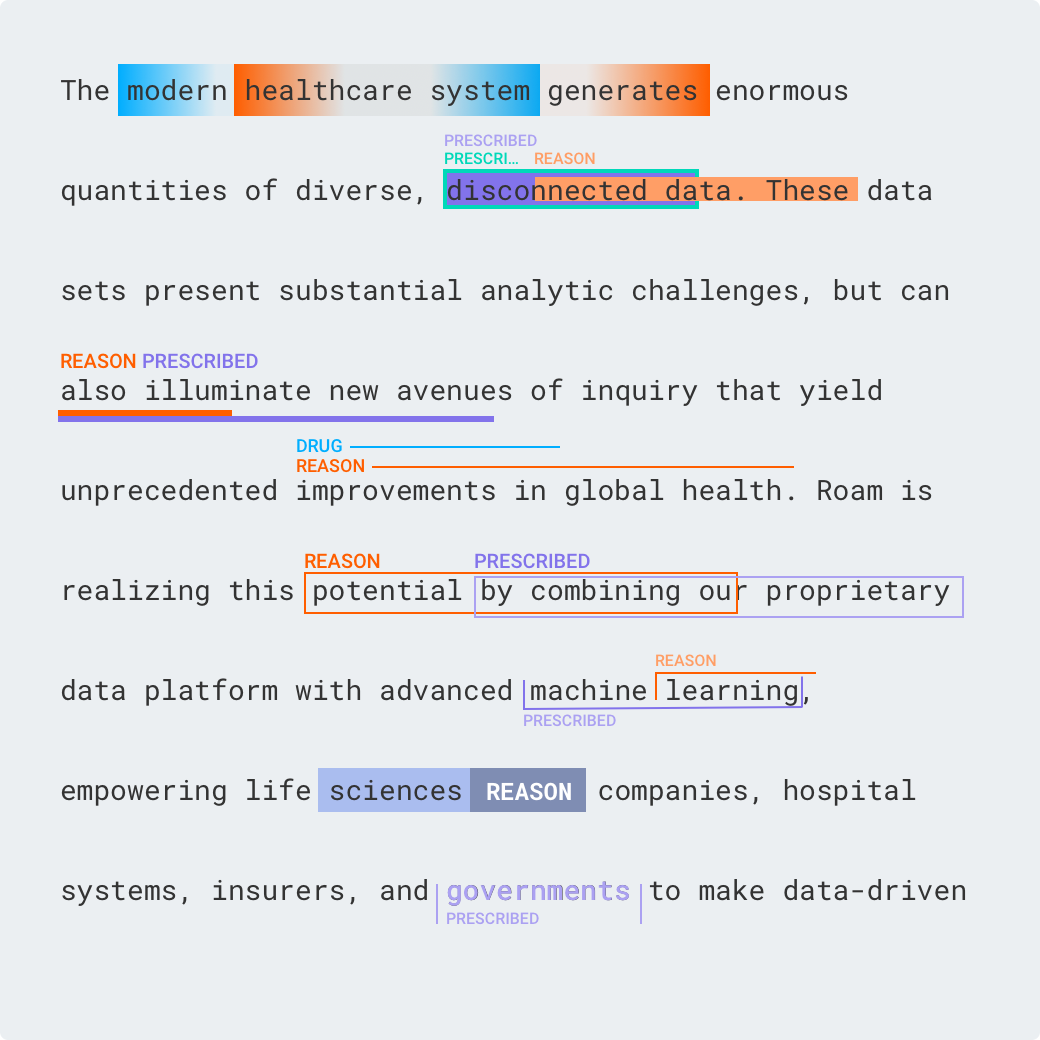
One of the biggest interaction design challenges was to create a text labeling interface. I had three constraints: 1) to support overlapping text annotations, 2) to allow connections between annotations (called relations), and 3) to keep the text legible.
There are a few text-labeling tools out there, but they all sacrifice text legibility. This was unacceptable for me. Test labeling is already a daunting task for users. Tools should help, not hinder comprehension. Optimizing for two constraints is easy; optimizing for all three constraints at the same time is borderline impossible.
It took a few dozens of iterations.
First, I tried out different ways to display overlapping annotations. Looking at existing projects, I noticed that annotations rarely overlap more than twice.
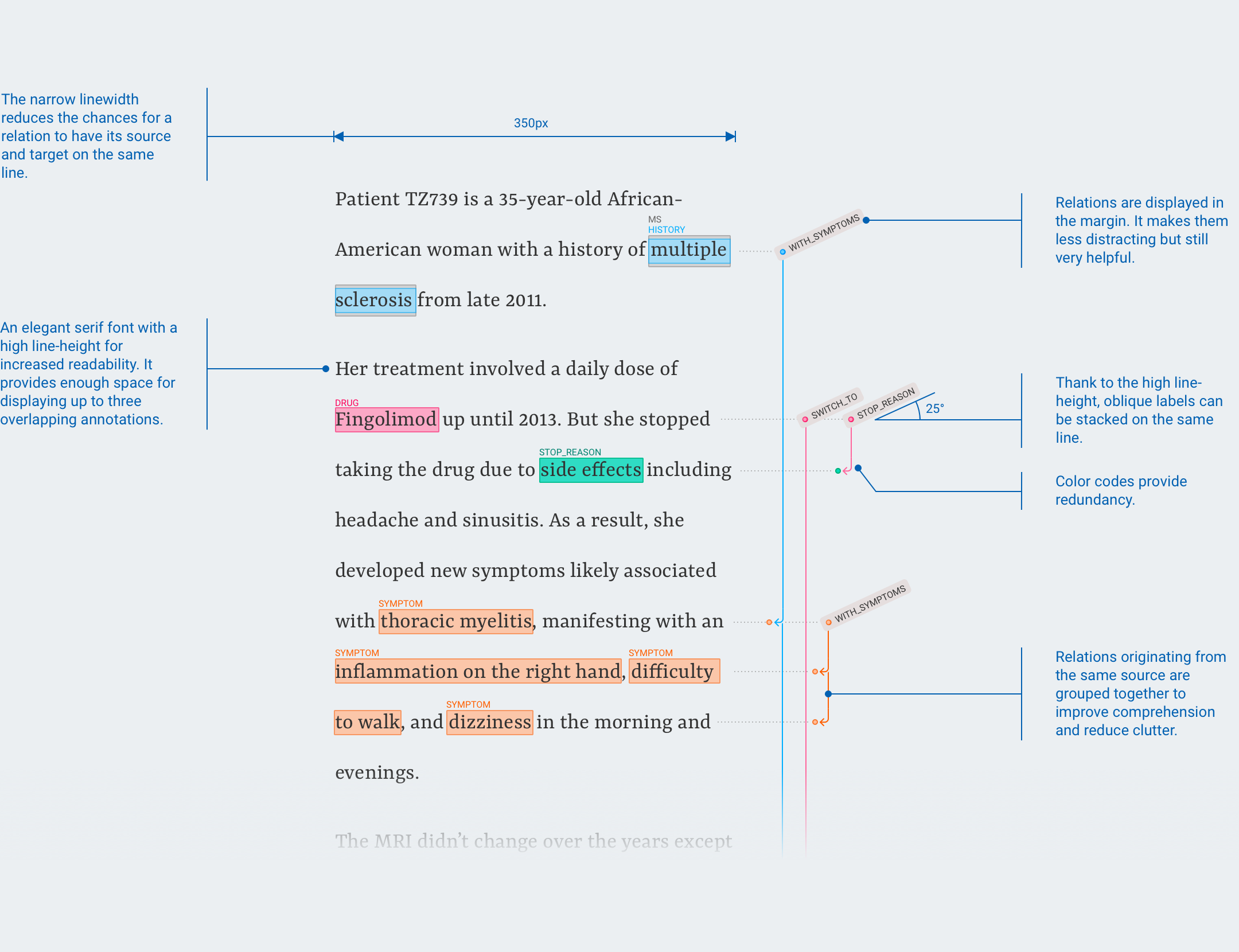
Increasing the line-height provides enough space for stacking up annotations and it improves readability.
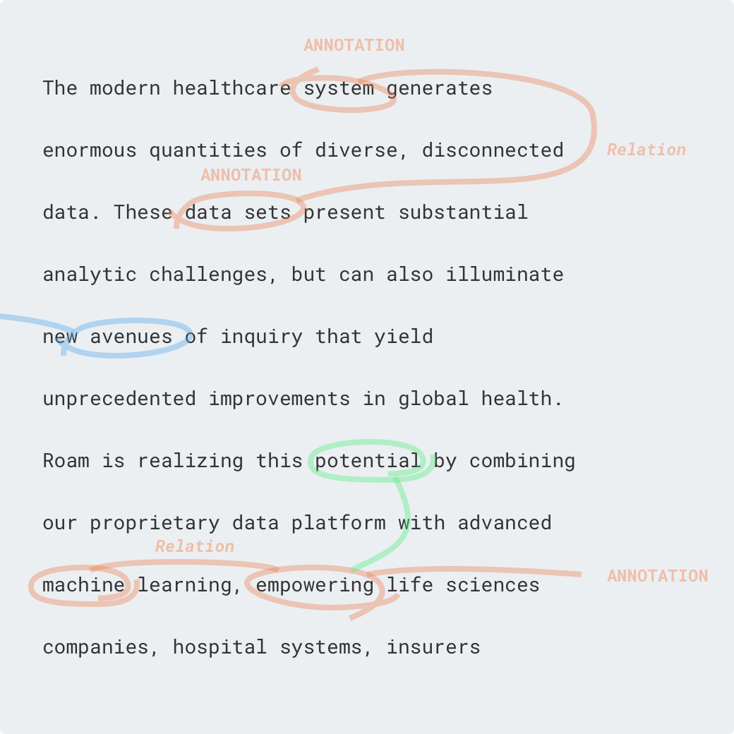
By far the biggest roadblock was displaying relations. I experimented on paper first. People have been annotating text for centuries, there might be something to learn from it.
I learned that creating annotations and reading someone else's annotations very different tasks. I decided to favor readability.
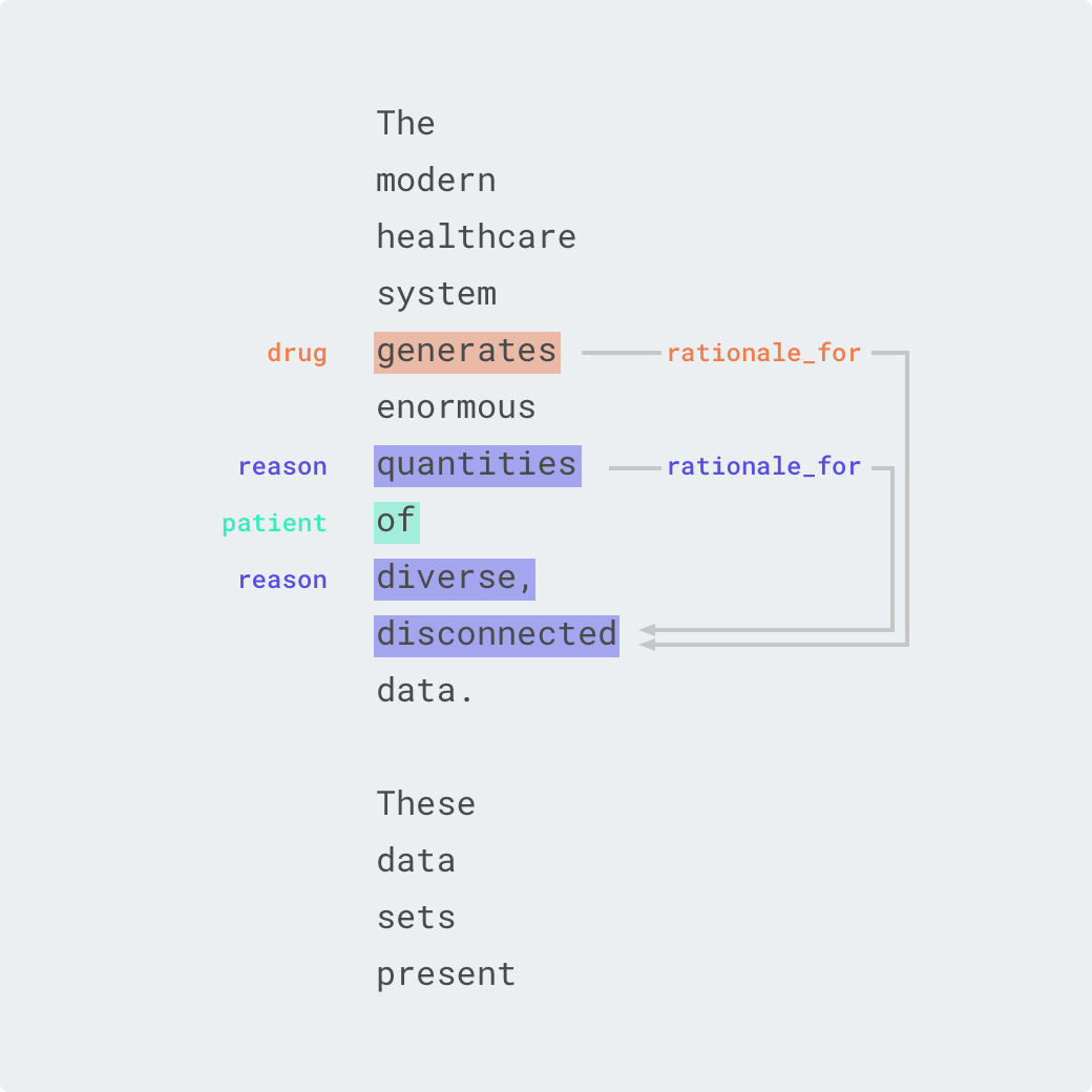
I tried to display relations in the margins or the rivers.
But it was too distracting and too hard to understand; requiring users to follow the lines with their finger.
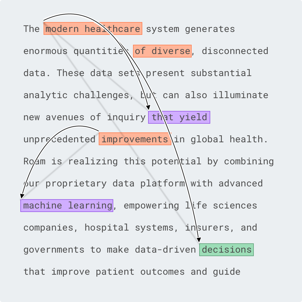
To circumvent the previous issue, I experimented with horizontal and vertical layouts.
I tested for reading speed and comprehension, which turned out to be poor.
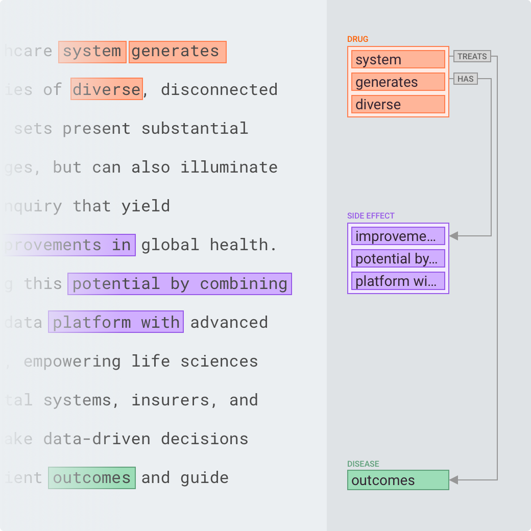
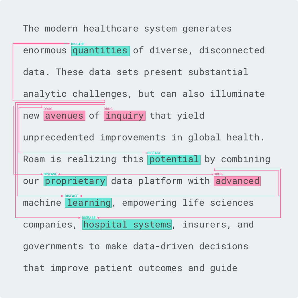
I noticed that most relations originated from the same source. What if we moved away from the strict layout imposed by the text and represented the annotations as a graph?
It reduced clutter, but users had to constantly move their eyes between the text and the graph.
Thinking outside of the box, literally. Using the third dimension was interesting but too distracting.
I also tried to display the relations on mouseover. But now, users had to move their cursor around to ensure they didn't miss any hidden relations.
After a few days of tinkering, I decided to ask for help. After exposing the problem to a handful of co-workers, I ran a workshop to generate new ideas. The workshop was a success in two ways: we found a solution, and the team felt empowered.
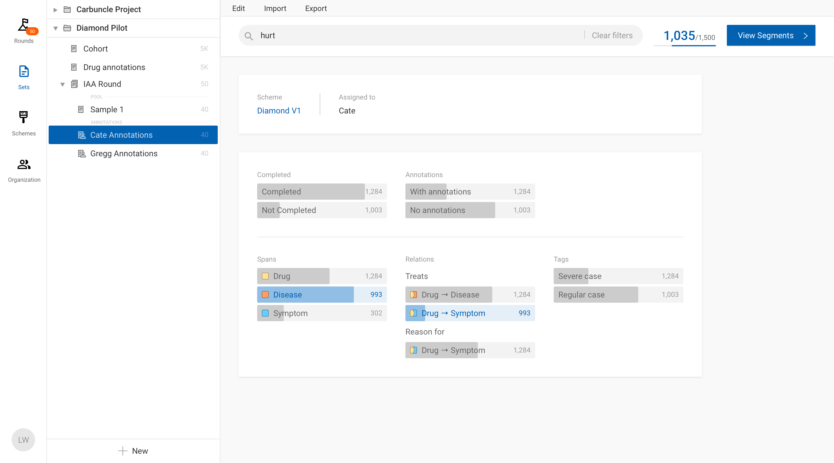
Here it is in action:
It wasn’t all sunshine and rainbows. This project is the largest project I had ever undertaken; not in term of scope, but in the size of the team and its impact. I made two crucial mistakes which resulted in having to rebuild 50% of the product and a six-month delay! The mistakes were: not testing assumptions early enough, and lack of ownership.
Testing assumptions early
In January 2019, six months after the start of the project, we finally received feedback from our first user. Laura, a nurse employed by Roam, used the tool for the first time on a new project. Her feedback was concerning.
Looking back, I can't believe we waited six months to get feedback. The Annotation Manager isn’t the only product I’ve built. I’ve helped develop a dozen products over the years, from mobile games to complex enterprise applications. I studied Human-Centered Design, and I know that testing early and often is paramount. And somehow, we got carried away.
That was a wake-up call. Why did I spend so much time building features when I should have done my designer's job? For the following weeks, I met with everyone who had used the tool. There were three main issues:
- The tool was too slow: text searches would take close to a minute to resolve. We clearly underestimated the size of the datasets.
- It was not flexible for nurses who worked on a flexible schedule.
- The integrated platform approach made it very hard for Data Scientists to integrate the tool into their workflow.
Interestingly, users loved the new annotation interface I co-designed with them. It was miles ahead from the leading annotation tool.
I went back to first principles. I realized that the current architecture was too limiting and a new mental model was needed. I created a series of interactive prototypes to test my assumptions. The prototypes went a long way in convincing end-users and leadership that there was a better way. Just a few weeks later, the team started working on a new version of the Annotation Manager. I had succeeded!
Lack of ownership
The tool was developed by the infrastructure and application teams. Because we advertised the tool as "the Roam platform”, engineers believed we needed to invest resources in creating a strong data infrastructure. This two-team approach resulted in no-one owning for the direction of the project. Both teams optimized for different metrics, and communication issues crept up. For instance, the tool was slow because one team was optimizing for database writing speed instead of reading speed. And the teams were constantly blaming each other.
I shared those concerns with leadership. They were taken seriously, but I encountered resistance to change. What I proposed — breaking up the teams — went contrary to the platform approach we had sold a few months ago.
Unfortunately, this top-down approach didn’t work. I was disappointed, but I was decided to change things. The bottom-up approach ended up being a better solution. During the prototyping phase, I made sure to include the implementation teams. I showed them my process and the reasons behind my decisions. I also used the opportunity to ask for their input which proved to be beneficial. By the end of the process, everyone understood the benefits of breaking up the platform into smaller units.
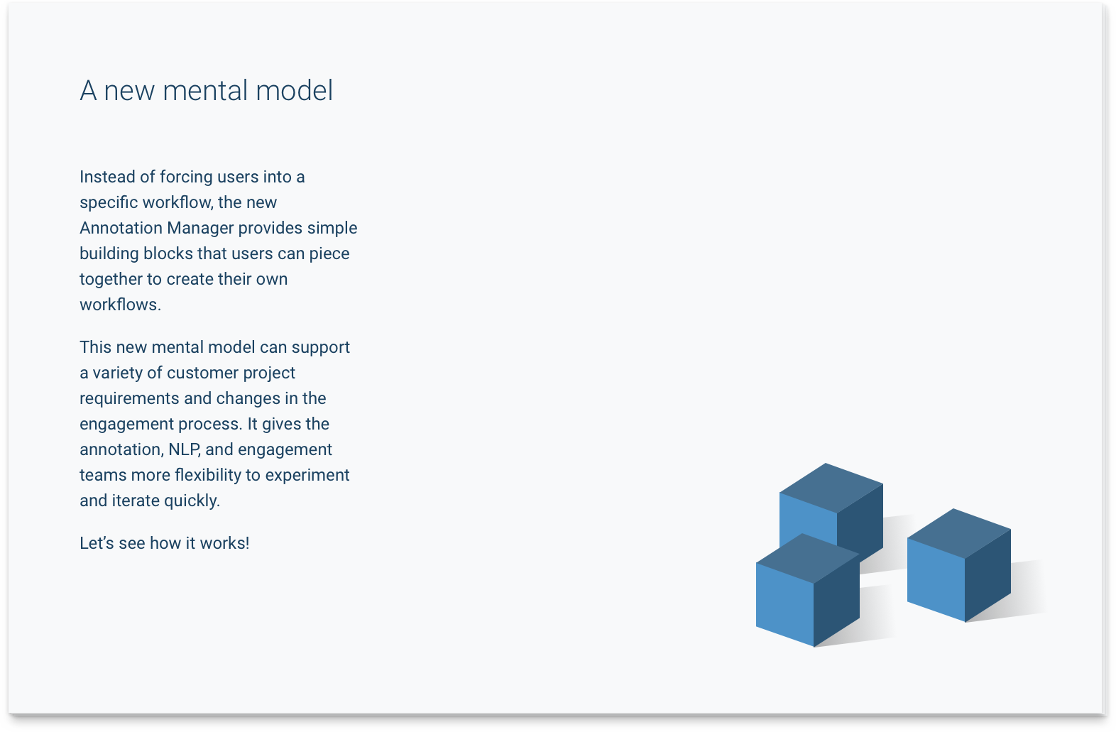
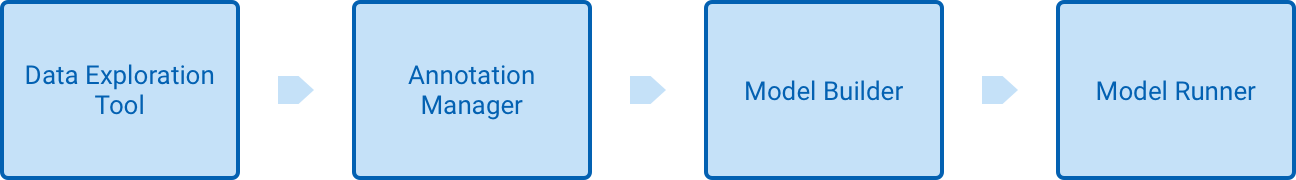
It was decided that from now on, the Annotation Manager's goal would only be to annotate text. Exploring data and training models would happen somewhere else. Once that was clear, it was easy to convince leadership to give full ownership to one of the teams. Today, teams are more independent than ever and morale is much higher. I believe this is the right approach to building successful platforms.
A better way to build platforms
Platforms are sexy. I haven’t worked for a company that doesn't want to be a platform. But platforms can mean many things depending on whom you talk to. People often think of platforms as a silver bullet. It's easy to convince ourselves that it will eventually solve all our problems. It blinds us and carries us away from our iterative approach to problem-solving.
I firmly believe that the best way to build platforms is to build a suite of independent and loosely connected products. The benefits are numerous:
- Independent products can evolve at their own pace. It makes it easier to iterate and mistakes are cheaper.
- A single team can own an entire product. Everyone on the team is aligned toward a single goal. Conway's law states that the structure of a system is a reflection of the communication pattern of its individuals. Because communication within teams is stronger than in between teams, products will naturally be loosely coupled.
- It’s much easier to avoid scope creep because each product fulfills one single goal. Trying to add a new feature that isn’t aligned with any of the platform's existing products? Let’s create a new product and a new team!
Cathal Horan from Intercom uses the metaphor of the city to describe platforms. He writes "Like any complex entity that changes over time, it is difficult to fully predict its outcome or plan its evolution." Building a monolithic platform from scratch is such a huge undertaking, chances are requirements will have changed before its completion.
Promoting design thinking through example
At a small startup like Roam (around 50 employees), I had to wear many hats: from Frontend Engineer to Product Designer, and even Product Manager. I believe many of the mistakes I’ve talked about could have been avoided if I had worn my designer hat more often.
It's not enough to be the only design voice at Roam. Even hiring more designers would not fix this issue completely. Creating a strong design culture is increasingly important. Recently, I’ve been empowering other people at Roam to have a product mindset. I've focused my efforts in arming people with design tools they can use to solve similar problems on their own. I found teaching by example to be a powerful tool. I’ve led multiple design sprints with cross-functional teams. My biggest surprise was seeing the emergence of design champions at Roam. As one of my teammates puts it: “Design was limited to the Annotation Manager, but Jordan brought it to the rest of Roam”.