Goggles
About
My Role
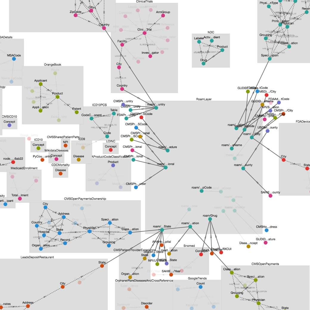
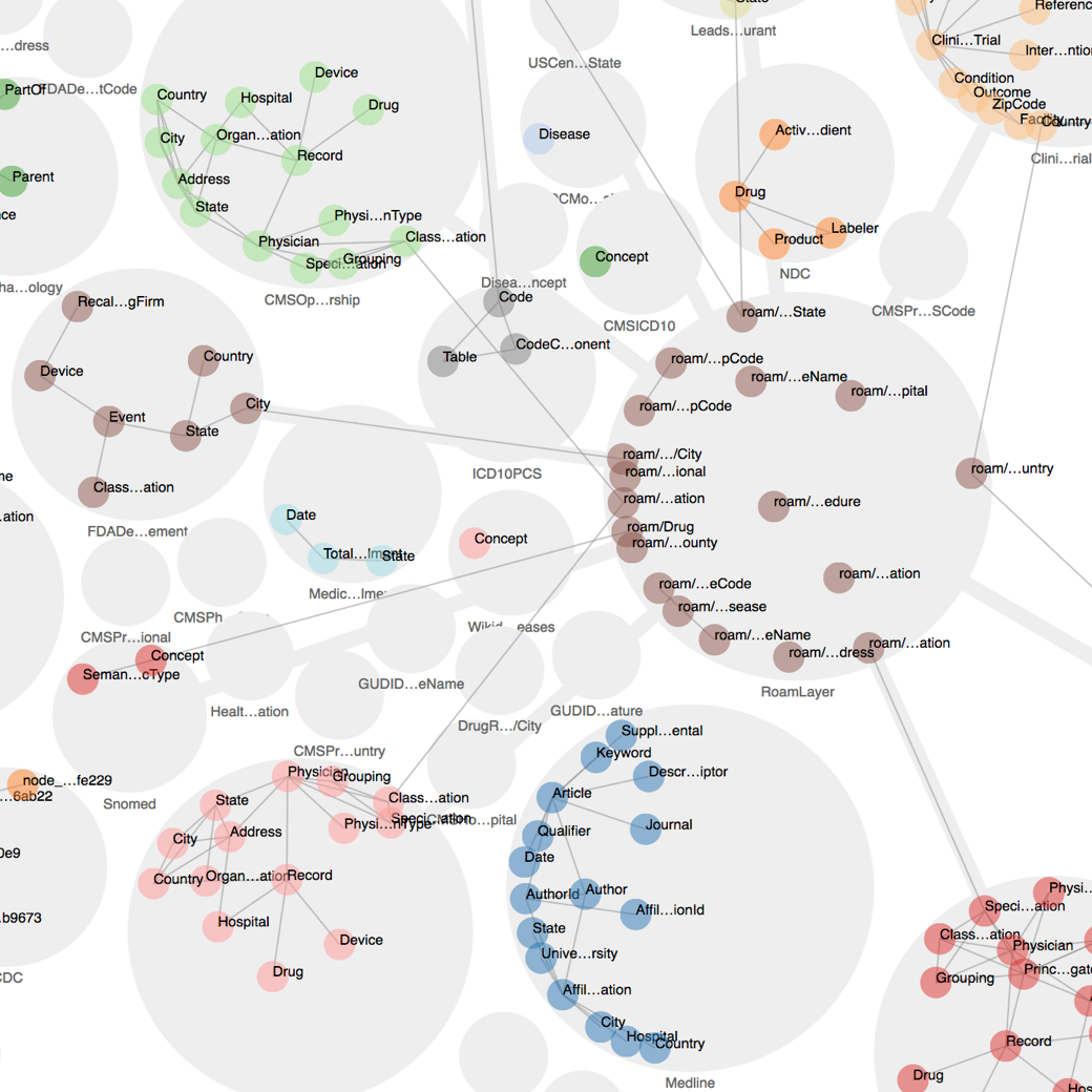
A month after I joined, I was asked to redesign Roam's internal tool called Goggles. The tool allows the team to inspect the Roam's Knowledge Graph — a large graph that contains all of Roam's health data. Nodes can be drugs, diseases, providers, etc. Edges connect nodes together. For instance the "Treats" edge connects a drug to a disease.
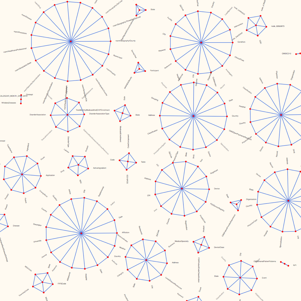
The existing tool couldn't keep up as the graph got larger and denser. The force directed layout simulation produced many edge crossings, awkward label placement, inconsistent node placement, and provided no structure or hierarchy to guide the eye. Additionally, each simulation generated a different layout. It hindered the user experience to a point where it was not usable anymore.
Framing the Problem
Part of my design process was to understand the problem as much as possible. This step is really important because it helps define the problem space and inform later decisions. When creating internal tools at Roam, the two most important questions to ask are:
- What is the purpose of this tool?
- What does the data look like?
The first question helps get to the underlying issue. More often than not, stakeholders and users already have formed an idea on how to solve the issue. There's generally more than one solution to a problem, and the obvious one is not always the best one. So, I try not to listen to solutions and instead focus on the user's current workflow and pain-points.
Understanding the data is a recurring theme at Roam. Roam is dealing with troves of data which user interactions are dependent upon. At the beginning of a project, I spend a non-trivial amount of time digging in the data to understand its shape, size, bias, and quality.
Main use-cases:
- Graph building: find ways to connect a namespace to the Roam layer (the central namespace).
- Look for inconsistencies: wrong or missing connections.
- Create search queries across namespaces.
Main finding on the data side:
- The graph is composed of namespaces. Nodes within namespaces have lots of connections. There are very few connections between namespaces, except to the Roam layer.
- Namespaces have 5–20 nodes, and there are less than 100 namespaces.
- The number of connections to a given node is low, generally 1–3.
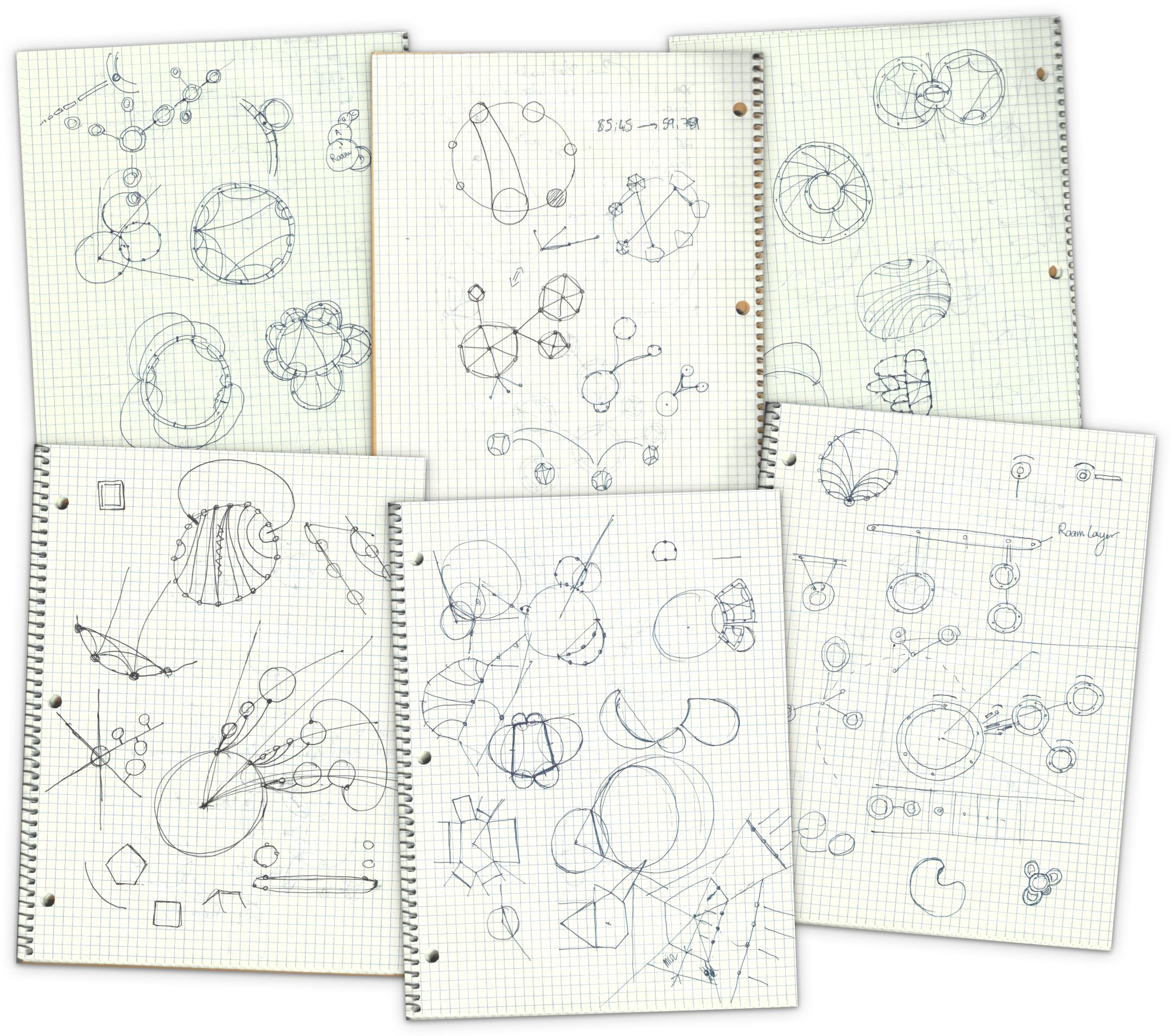
With that in mind, I sketched a few ideas that I prototyped.
Ideation
Pen and paper is the best way to get started, generate, and refine dozen of possible ideas. The finding about the data, especially that the graph is composed of loosely connected namespaces was critical. These constraints help design an ideal solution that answers a specific problem.
In this case, a generic solution would have been to implement a force directed layout. It's a one-size-fit-all solution that's often used to easily display networks. There are many libraries out there to create such layouts.
However, I believe the role of the designer is to understand that specific use-cases require specific solutions.
Prototyping
Where designs hit reality
It's one thing to produce a pretty sketch or mockup, it's another to implement it. For data-dependent projects like this one, prototyping is an indispensable step in my design process. During the prototyping stage, designs are refined to fit the data or tweak the user interaction.
And this is far from being a linear process. After each unsuccessful attempt, I go back to the dawing board and try to come up with new solutions. It took 8 prototypes and countless of sketches to arrive at a solution that felt right and worked well with the data.
Some failed experiments — like the ones below — spiked new ideas.
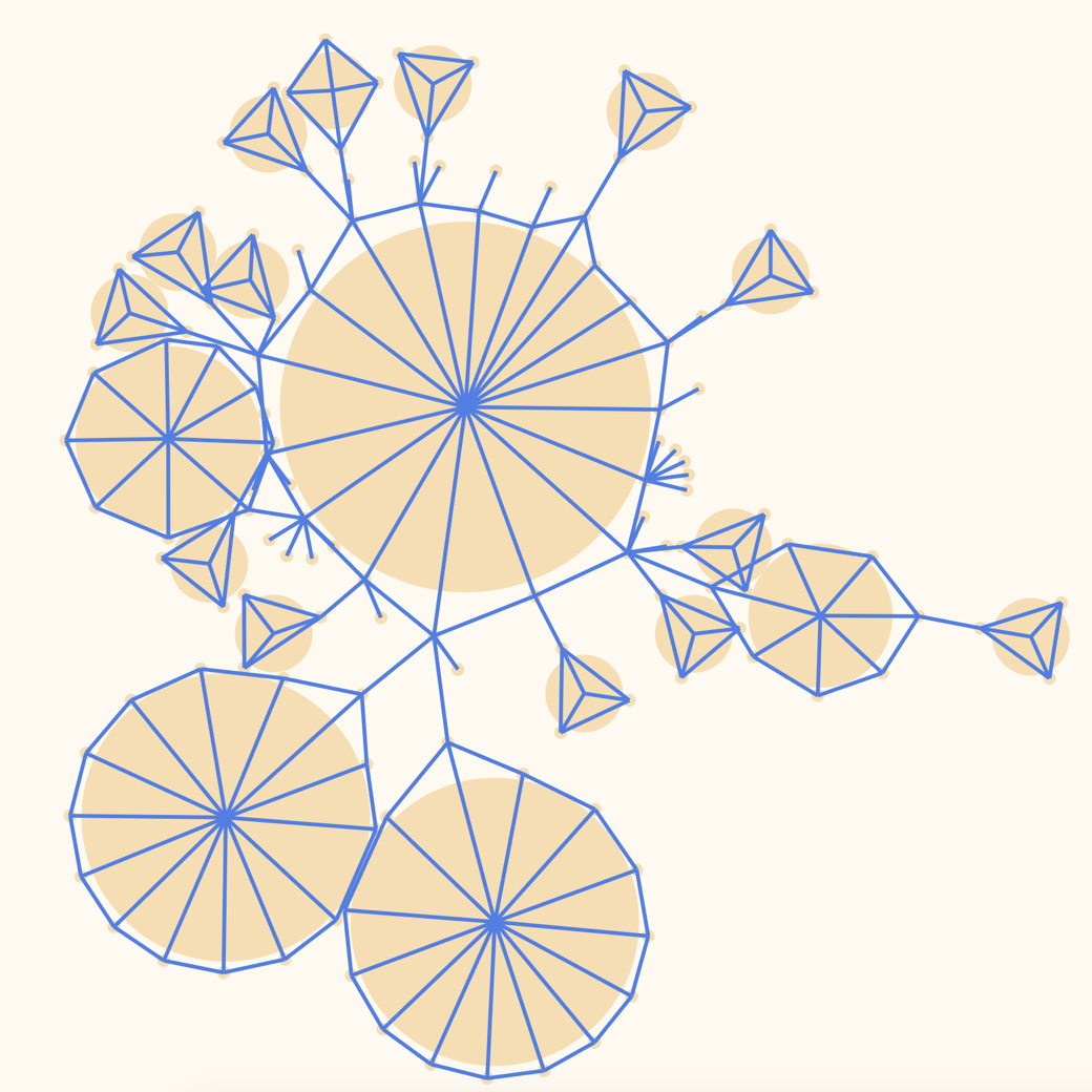
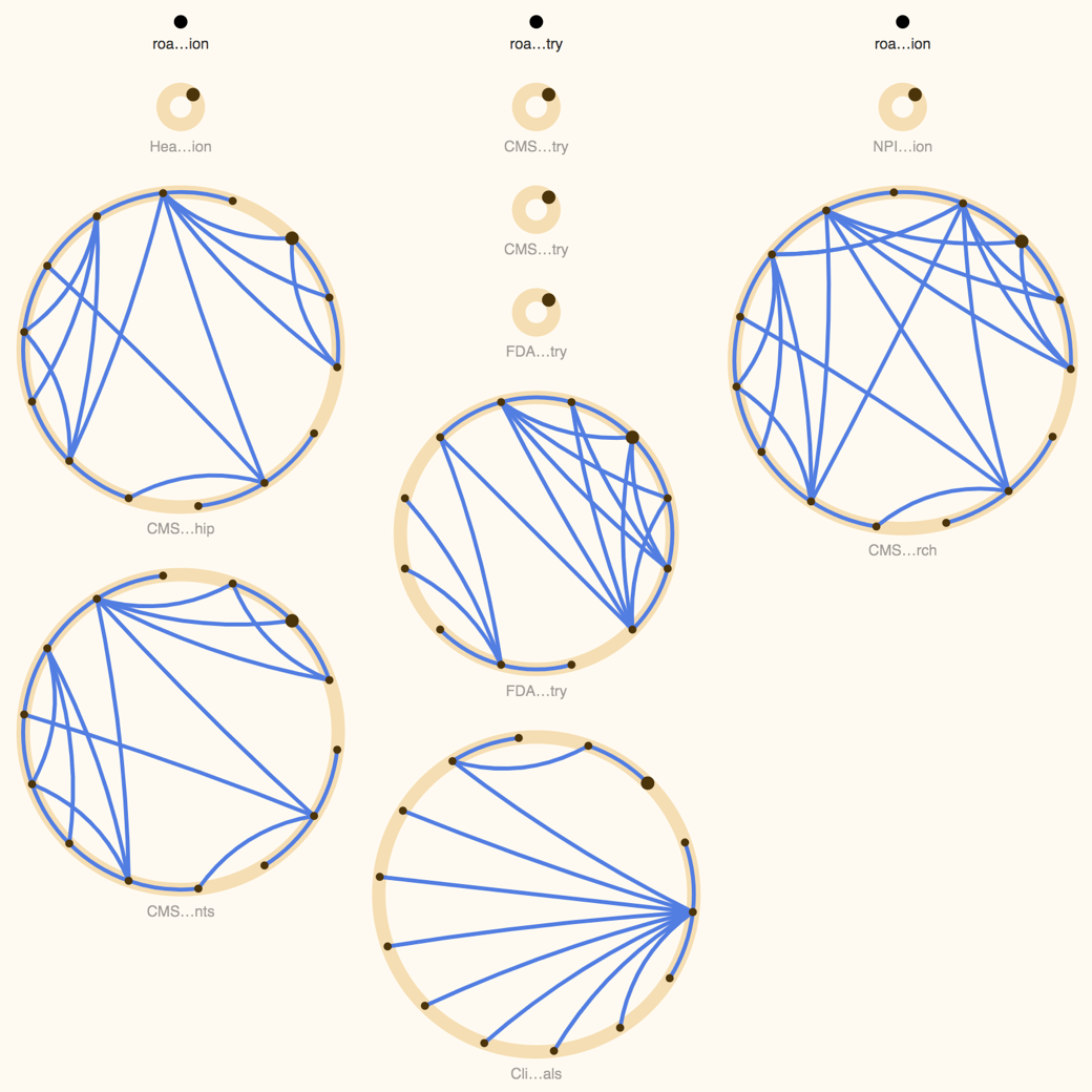
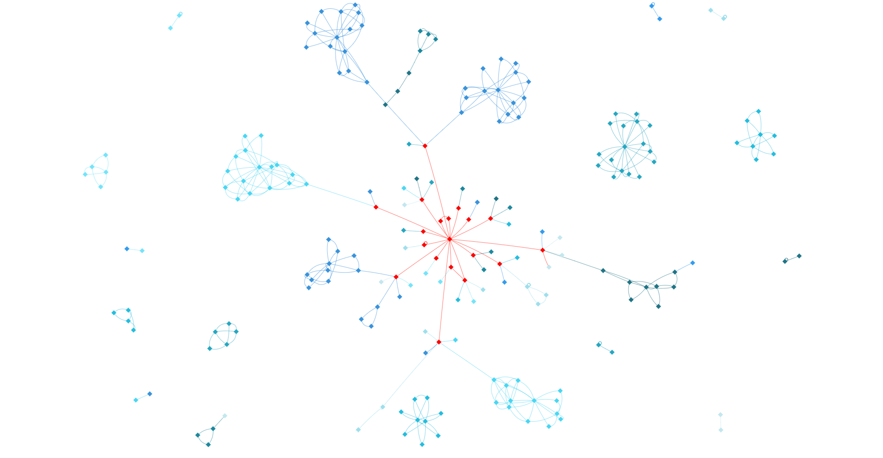
With graph layouts, there's always a balance between enforcing structure (using predefined rules) and letting some physics or generative algorithm create a more organic layout. On one hand, you have 100% control with structured layouts. They allow you to exactly define how things look, improving readability, consistency, and hierarchy. But these layouts require a lot of scientific and engineering work. On the other hand, one could use some physics simulation algorithm to generate a satisfying layout. It's less labor intensive, but the result can be approximative.
I went with an intermediate approach. I needed to control the position of the nodes within the namespaces. It's very important at the namespace level to show which nodes are connected to which nodes, and to do so in a consistent manner. Thus, I had to manually specify how to lay out nodes. However, the connections between namespaces are sparse and act more as a navigation element. Here, I was able to use physics simulation. It gave the visualization an organic look and it had the extra benefit of making animations easy to implement.
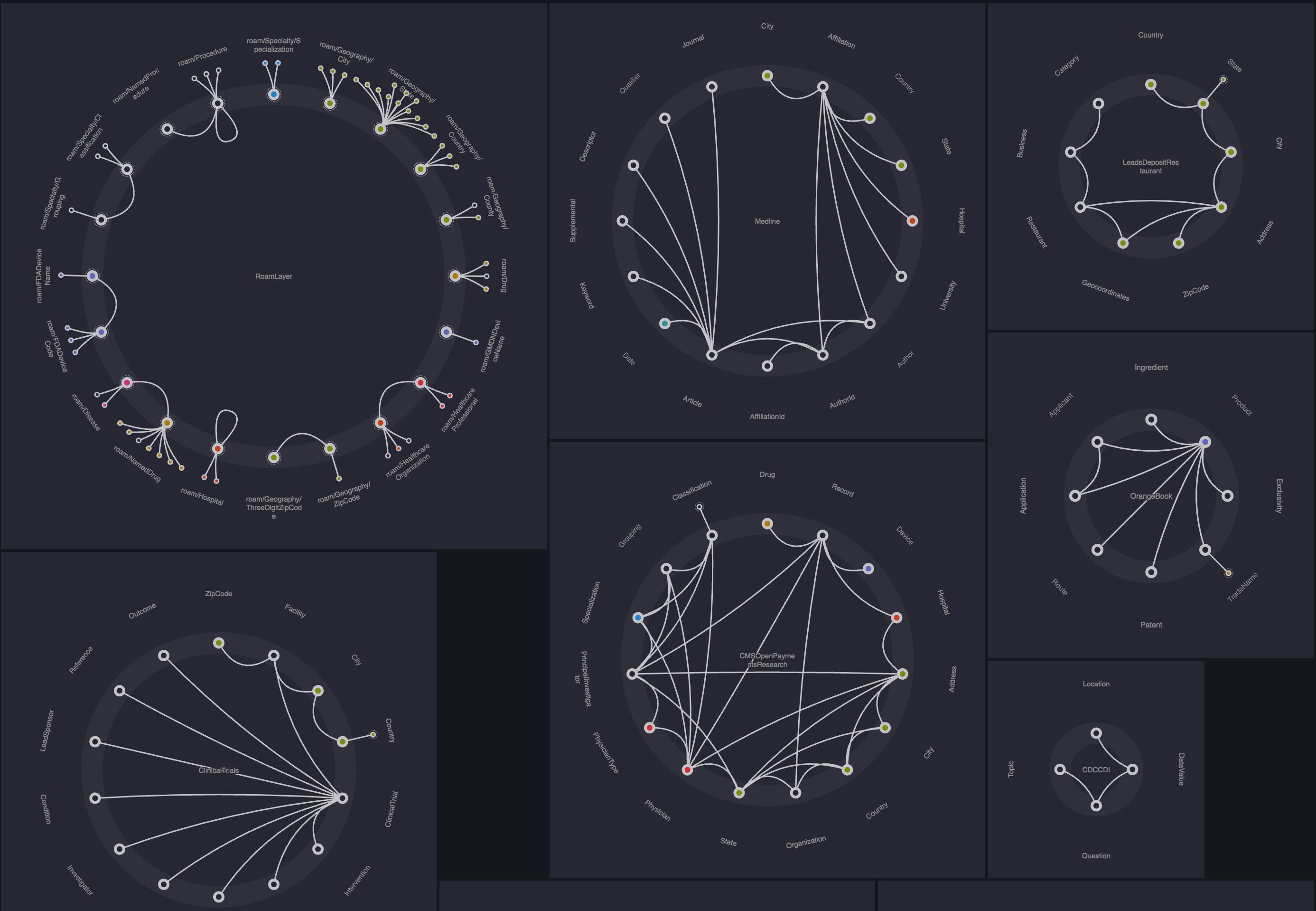
Result
The mix of structured namespaces and organic physics simulation was the a-ha moment of this project. See for yourself:
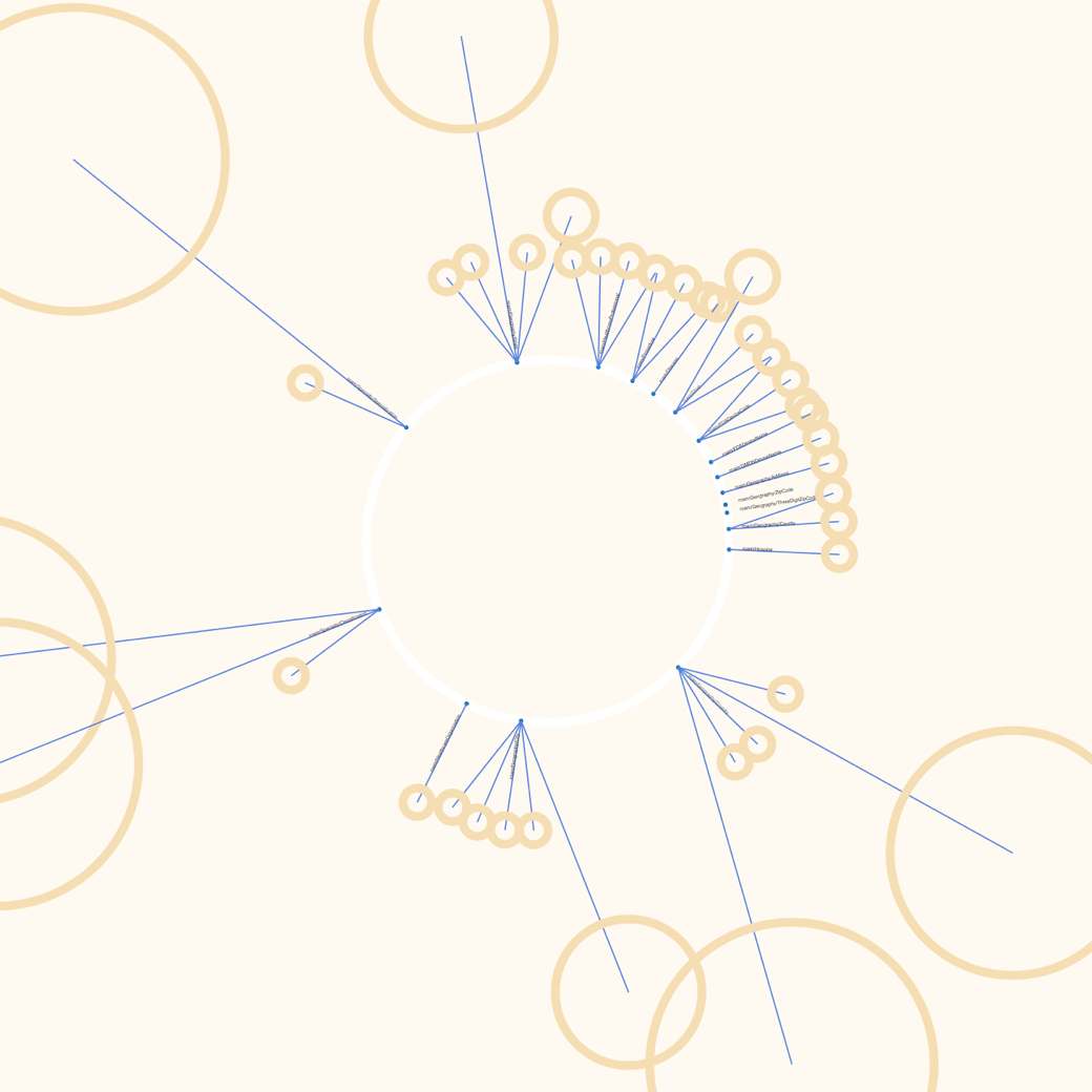
I decided to show a maximum of two namespaces at the same time. Everything else is hidden until someone expands it. This is key to reducing visual clutter and allowing the users to focus on the task at hand.
It's still possible to explore the graph. Visual aids show which nodes can be expanded to inspect linked namespaces. This design decision was highly influenced by the research findings. Additionally, a "specimens" page lists all available namespaces to complement the original visualization.
This project was incredibly challenging. It took weeks to come up with a concept that made sense to the users and worked with the data. But I'm very satisfied with the result. It looks like nothing out there!
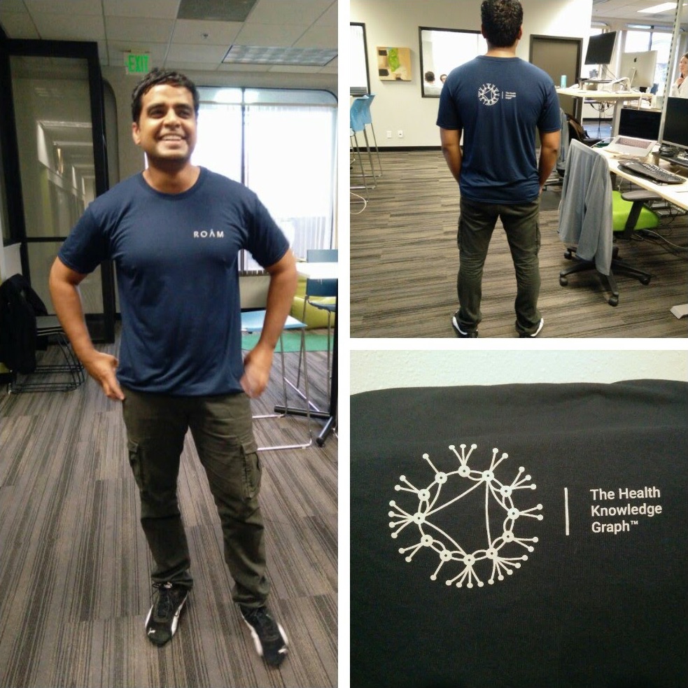
The team was impressed by the new tool and it's now used internally. People loved the new layout and they even asked me to create t-shirts for the team. That's how I define success! :)